
[ad_1]
These five questions and answers show how much our planet has already changed.
1) Which regions emit the most CO2?
Governments are increasingly pledging to transform their economies to become carbon neutral within the next 10 to 30 years. With emissions stabilizing in Europe and the Americas and rising in Asia and Africa, the following chart shows how much of an economic turnaround carbon neutrality would need.
Absolute emissions, however, only tell half the story. Countries in Asia have seen immense population growth over the last decades, and more people leads to greater consumption of resources.
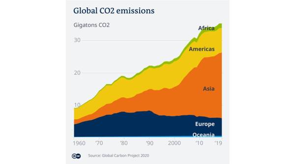
Seen from a CO2 per capita perspective, the picture is very different. Factoring in population size puts the spotlight on both Western countries like the US and Australia, as well as nations in other parts of the world, including Russia, Saudi Arabia, Oman, Qatar and Mongolia.
In the discussion about who should contribute most to emissions reductions, experts argue that not all nations can be held equally responsible, and that economic power and wealth should be taken into account.

Clustering countries in terms of income groups (see below) shows a connection between higher levels of income and higher median emissions per capita. It also reveals how countries within each group vary widely, and that the higher the income group, the wider the spread across the emissions spectrum.
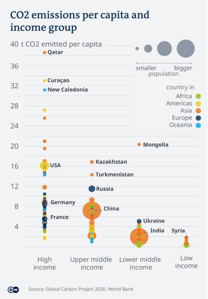
High income countries with elevated emissions, such as Qatar, emit much more CO2 per capita than countries like Germany and France, although they are in the same income group.
And although countries like India and China rank low on per capita emissions, their decisions still have a big impact, given their huge population numbers (bubble size).
2) What are the major sources of greenhouse gas emissions?
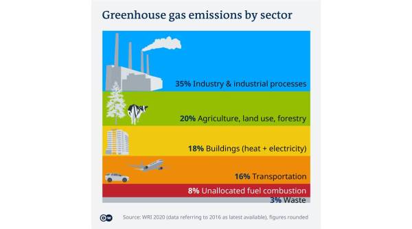
Given the correlation between economic strength and CO2 emissions, it’s no surprise that the industrial sector is responsible for the lion’s share (35%) of overall greenhouse gases (GHG) — including methane and nitrous oxide — released into the atmosphere.
At 20%, agriculture, forestry and change in land use collectively account for the second greatest source of GHG emissions.
Over the last two decades, the annual amount of tree cover lost has gradually increased. Russia, Brazil and the United States were the world’s biggest drivers of deforestation in 2020.
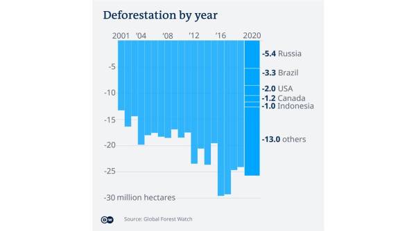
Compared to the decade from 1990-2000, however, the rate of deforestation has slowed.
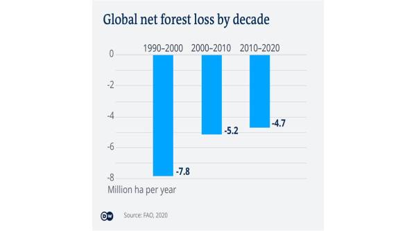
Deforestation is not only problematic because the CO2 previously stored in the ground and the trees themselves is released into the atmosphere, but also because forests and soils are “carbon sinks” that absorb atmospheric CO2 — making them a valuable tool in the fight against climate change.
3) How have CO2 emissions developed over the last centuries?
CO2 emissions from burning fossil fuels have been on the rise since the early days of industrialization. However, as humans produced higher levels of carbon dioxide, Earth absorbed it in natural “carbon sinks,” such as forests and oceans.

But as humanity began to produce more CO2 and other greenhouse gases than the planet’s ecosystem could naturally absorb, more of those emissions became trapped in the atmosphere (red area in the following chart).
4) How much has the world warmed already?
An increasing volume of CO2 particles traps the sunlight’s warmth in the atmosphere, acting like a greenhouse in which it gets warmer and warmer. Compared to the 20th century — and the past five years in particular — the average global temperature has increased by almost 1 degree Celsius (1.8 degrees Fahrenheit).
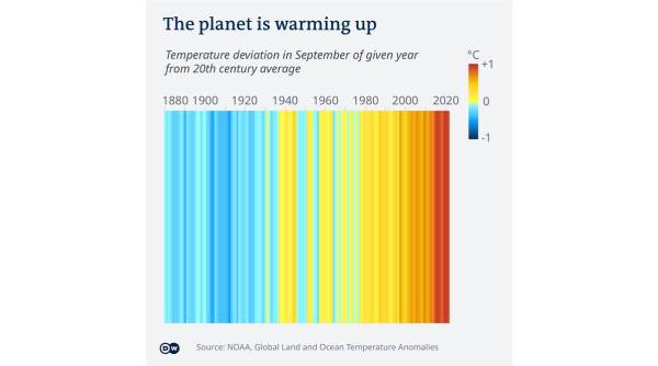
This change is measured by calculating the difference between temperatures observed at a specific time and place and the historical average for that same spot. The 1 degree increase in temperature is the global average of those variations. The difference can be much greater on a local level.
In a more concrete example, the average August temperature in the northwestern US city of Portland was around 20 C from 1991 to 2020. With global warming, Portland is seeing hotter-than-average days. On August 13, for example, the daily average reached 30 C, which was an extreme temperature anomaly.
In the same week, unusual temperatures were recorded in Spain, Tunisia, Russia, India, Cambodia, Australia and Argentina, to name just a few countries.
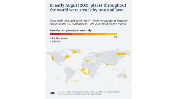
Such temperature increases push Earth’s temperature anomaly up and will have potentially wide-ranging effects — from pockets of impossible heat to failing harvests and an increase in dangerous events like storms and floods. A rise in sea levels is among the most noticeable impacts. Hotter temperatures are melting ice caps and glaciers and increasing the total amount of water in the oceans.
5) How much sea level rise do we already have?
According to data compiled by the National Oceanic and Atmospheric Administration (NOAA), the United States government climate research agency, sea levels have risen nearly 25 centimeters (9.8 inches) in the last 140 years. Around one third of that increase happened in the last 25 years alone.
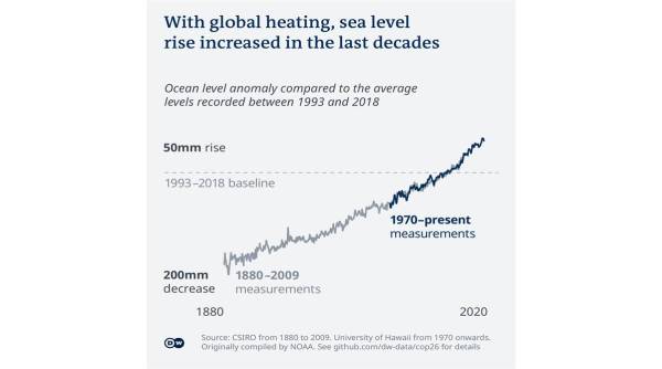
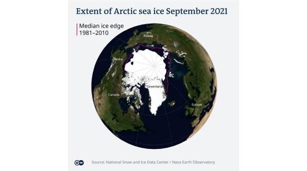
Sea levels are rising worldwide, but the trend is accentuated in the Arctic, which is heating faster than other regions.
The thermal property of water that allows it to expand when warmer is also contributing to rising sea levels.
As usual, there is a caveat to the absolute numbers. While most of the world’s oceans and seas are indeed higher their historical levels, some areas are more affected than others.
Tide gauges in western Canada and northern Chile, for example, detect steady or even receding seas, whereas island countries in the southern Pacific and Indian oceans are witnessing alarming increases in levels — threats that could lead to them literally disappearing beneath the waves.
[ad_2]
Source link