[ad_1]
The Galaxy Tab might be a distant second to the iPad when it comes to tablet market share, but Samsung is hardly ready to concede the crown. Its newest tablet, the S7+, isn’t just its best and biggest, but it’s easily the closest you’re going to get to an iPad Pro without shopping in an Apple Store.
Samsung’s Galaxy S tablets have always showcased the latest tech and specs, and the S7+ is no different. It boasts the Snapdragon 865+ processor, up to 8GB of RAM and 512GB of storage, a giant 10,090mAh battery, and 5G support.
But what gives the S7 its “plus” designation isn’t the specs–rather it’s the 12.4-inch screen, the biggest in a Samsung-made Android tablet since the 18.4-inch Galaxy View. That’s about two inches bigger than the 10.5-inch Tab S6 and gives Samsung a true competitor for the 12.9-inch iPad Pro.
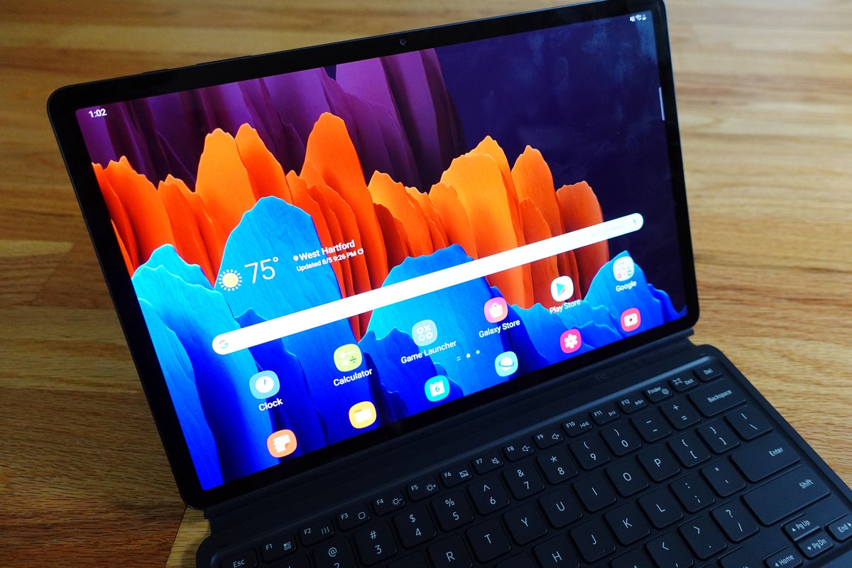
And what a screen it is. Samsung has been using OLED displays in its tablets for years, but the one in the S7+ is far and away its best. It’s impressively bright and vibrant, with a 2800×1752 resolution. Samsung’s first 120Hz refresh rate in a screen this big looks incredible and feels as smooth as silk. It’s especially great with the S Pen, which now has a 9ms latency to match that of the Apple Pencil.
 Michael Simon/IDG
The Galaxy Tab S7+ is built as well as an iPad Pro.
Writing feels as smooth as if you’re writing on a piece of paper with a ballpoint pen, and the stylus is remarkably light compared to the Apple Pencil. It’s also included in the box rather than a $129 add-on. You’ll want to get at least a Book Cover ($80) for the back, which provides a nice holder for the S-Pen. Otherwise, it will surely fall off its perch on the rear of the Tab S7+.
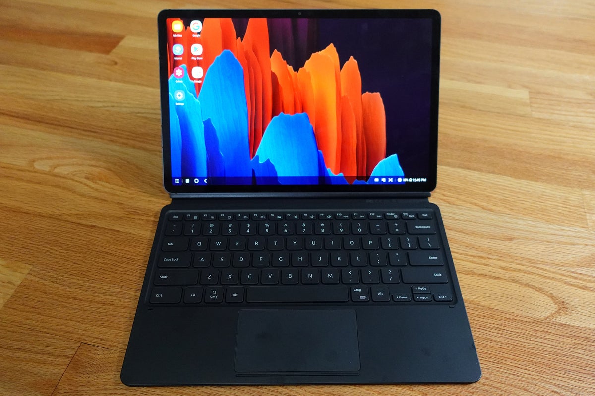
You could also opt for the Keyboard Cover for an extra $230, and it comes highly recommended if you’re going to do anything other than watch movies. At 12.4 inches, the Tab S7+ is a bit unwieldy, even if it is shorter (285 x 185 x 5.7mm vs 280.6 x 214.9 x 5.9mm) and lighter (575 vs 643 grams) than the iPad Pro. The keyboard isn’t nearly as sturdy as the iPad Pro’s Magic Keyboard—I struggled a bit to line up the magnetic backplate so the S Pen fits in its slot—but it makes whatever you’re doing on the Tab S7+ much more ergonomically feasible.
 Michael Simon/IDG
The display on the Galaxy S7+ is simply gorgeous, but you’ll want to get a keyboard.
The keyboard includes a row of “16 intuitive function keys” that brings a bit of PC functionality to the Tab S7+ and includes volume, brightness, and navigation controls. It’s useful—though being able to use the secondary keys without holding “Function” is a sorely needed toggle—but it also makes the trackpad a bit smaller than it is on the Tab S6’s keyboard. I’d prefer backlighting, but the keys have a nice springiness to them, and typing is a pleasure.
There’s no denying that Samsung has taken some inspiration from the iPad Pro, but the Tab S7+ is great in its own right. The AKG speakers are fantastic, the camera is properly positioned on the landscape side, and the build quality is beyond reproach. I wouldn’t mind a second USB-C port and maybe a Galaxy Fold-style fingerprint scanner built into the power button (Samsung’s virtual in-display scanners aren’t nearly as reliable), but otherwise there isn’t much I would change about the Tab S7+.
Software is another story
While the hardware gets an A+, however, the software and app support severely drag down the overall grade. Much of it is out of Samsung’s hands—Android’s UI and app support for tablets is woefully bad—but even when you stick with the stock Samsung apps, the S7+ experience just doesn’t feel as natural as it does on the iPad. iPadOS certainly has its issues, but using One UI 2.5 on the Tab S7+ feels like a stretched phone interface rather than a dedicated tablet one.
 Michael Simon/IDG
DeX on the Galaxy Tab S7+ turns Android into a Windows rip-off.
Take the new Notes app. While it’s definitely one of the highlights of One UI 2.5, the interface still feels like it was made for the vertical Note 20 rather than the widescreen Tab S7+. Menus open in new windows rather than dropping down, the organizational sidebar is a permanent part of the home screen, and notes have black space on the sides that could be used for attachments or tools.
Where the Tab S7+ could set itself apart from the iPad and the rest of the field is with DeX. It’s a separate environment accessible only when the keyboard or an external display is attached, and it turns your Android tablet into something of a Chromebook. There’s a dock and PC-style controls, and windows are floating and resizable, but even after several years of development, it’s still very much a work in progress.
The unit I tested is a pre-production model, so some wrinkles will likely be ironed out. But the overall problems will remain: Android on tablets isn’t great, and no level of hardware design will fix that.
The Galaxy Tab S7+ is the best tablet I’ve used aside from the iPad Pro. It’s too bad Samsung can’t just load it up with ChromeOS before it ships.
[ad_2]
Source link