
[ad_1]
Microsoft has revealed what it’s thinking about for upcoming iterations of Microsoft 365 and its Office apps, combining a flexible ribbon and a more muted color scheme with adaptive commands and a greater emphasis on artificial intelligence.
In a blog post on Tuesday, the chief designer of Office 365, Jon Friedman, said that some of the changes were on the table, while others were simply exploratory. Friedman didn’t provide a timeline for the changes beyond a “year or two,” but it’s likely that this will be another wholesale update of the Microsoft 365 (formerly Office 365) suite.
Microsoft has continually updated Office over time—and it’s had to, as it’s asking customers to spend about $70 per year just for a personal license to what’s now called Microsoft 365. In 2018, the new innovation was Microsoft Search, the search box that lives at the top of apps like Outlook and SharePoint. Last year, Microsoft showed off Fluid Framework, a way to turn all Office documents into “living” documents that could be constantly updated. This year, Microsoft decided to open-source the technology, but explained that one way Fluid would work would be to embed tables, charts, and task lists into Outlook for the web, so that sales numbers, project tasks, and research reports are always up to date.
 Microsoft
 Is this Microsoft 365’s new app ribbon? It certainly looks like it.
What’s new for Microsoft Office
Microsoft kicked off its Inspire partner conference this week with even more improvements to Microsoft 365 apps and especially to Teams. Friedman is looking even further ahead. “We’ve been on a multi-year design journey to create more focused, immersive experiences, from the single-line ribbon, to Dark Mode, to Fluent,” Friedman wrote. It appears that Microsoft’s goal is to pare down some of the Microsoft 365 visual elements. ”The next wave of Microsoft 365 UX changes will go even further by fading brand colors from app headers and exploring adaptive commanding. A flexible ribbon that progressively discloses contextually relevant commands at the right time just where you need them.
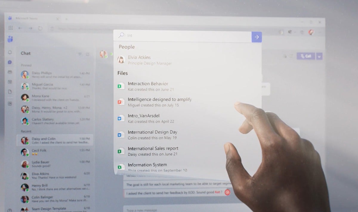
“We’ll further advance our seamless, cross-suite Search to bring relevant information to your fingertips, and myriad forthcoming experiences will leverage Fluid Frameworks,” Friedman added.
 Microsoft
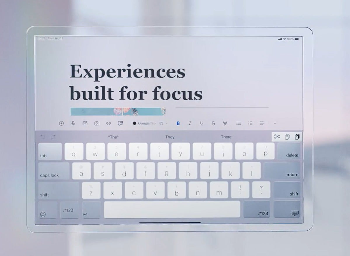
 Microsoft Word on a tablet. No bright, distracting colors here.
Visually, it sounds like Microsoft may remove elements, not add them. Microsoft plans to tone down the bright colors that have differentiated the Office suite, favoring something a bit more muted. “What extraneous visuals can we remove so your content, not the UI, becomes the sole focus?” Friedman asked.
A design video that Friedman showed off includes Office apps spanned across a tabbed interface–it’s possible apps like Word and PowerPoint could exist in the same window. If that happened, it would be the incarnation of Microsoft Sets, a tabbed interface for the Windows UI that surfaced in 2017, then disappeared without fanfare.
 Microsoft
 What documents might you want to share in Teams? Microsoft says that AI may help to winnow down your choices.
Microsoft’s also thinking about how you can express your personality virtually, across Microsoft’s collaborative apps. “Our tools have long supported the expression of your ideas, but as work and life converge, you may want to communicate who you are beyond an avatar photo,” Friedman wrote. “From more artful themes and backgrounds to exploratory UX around how someone might express their gender, culture, or hobbies, we’re designing for more authentic and inclusive connections between people.”
 Microsoft
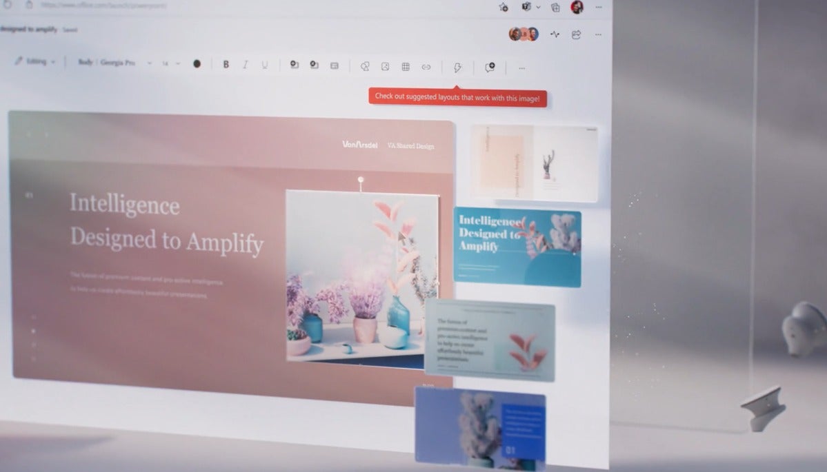
 Microsoft already uses AI to suggest design options, and it looks like this will become more sophisticated over time.
Microsoft is also exploring ways for people to express themselves asynchronously. This doesn’t mean a return to email, where people exchange notes back and forth on their own schedule. Instead, Friedman says Microsoft is thinking about adding video comments in chats—something that other platforms, like iOS, have had for some time.
Microsoft has focused on AI ever since Cortana debuted in Windows 10, and you can expect to see more here, too. Some of these improvements may be a bit difficult to define—Microsoft promised AI will continue to help provide context that you would otherwise have to define. Here, it appears that you may see a commonality of commands across apps: Will PowerPoint, for example, suggest a specific Teams chat in which to share your presentation? Microsoft might be headed in that direction.
 Microsoft
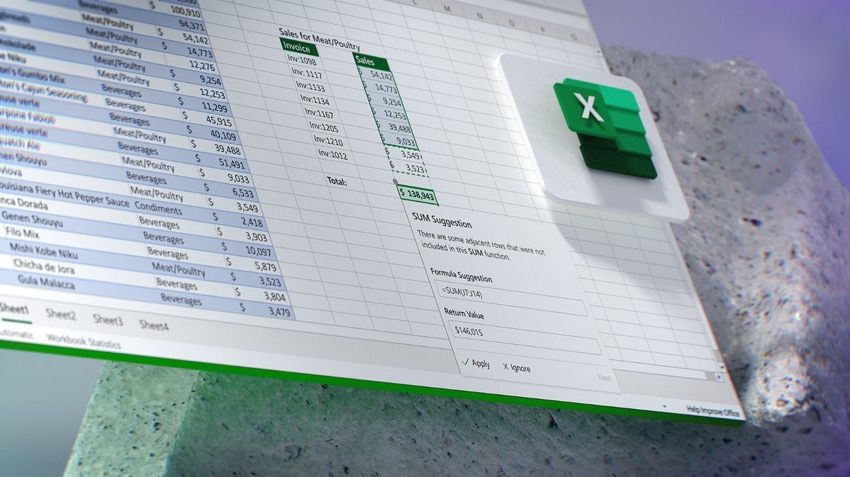
 Excel will note what it thinks are errors and alert you to them.
Other plans, though, will be more grounded. Friedman specifically said that Excel will start to recognize your errors and select alternatives, and Planner will start to auto-suggest target dates based upon what it knows of the task.
Given what we’ve seen of additions like Microsoft Search, we can be relatively certain that Microsoft will roll out these changes over time—probably slowly, and in a relatively scattershot process that jumps from app to app. Even though the timeline is unclear, these images offer an intriguing glimpse of the future of Microsoft 365.
[ad_2]
Source link