
[ad_1]
I really wanted it to work. A couple of weeks ago I closed my MacBook on a Friday afternoon with no plans to open it for a week. I wasn’t going on vacation—rather, I was testing the theory that the iPad could actually be “a computer.”
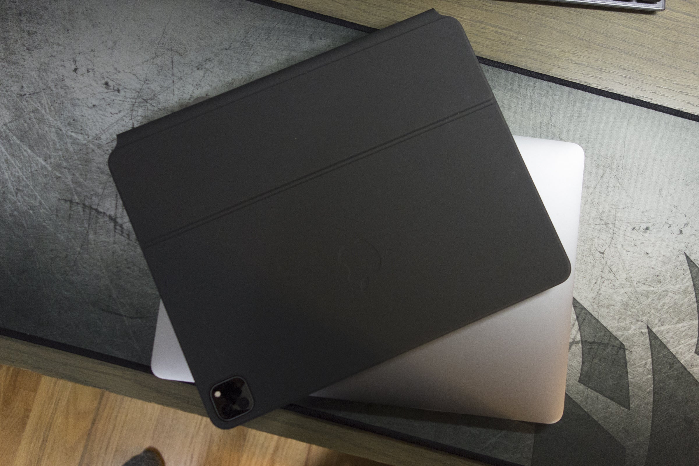
My setup was as high-end as you could get: a 12.9-inch iPad Pro with 1TB of storage and cellular connectivity, a Magic Keyboard, and Apple Pencil—a setup that’s more expensive than the 13-inch MacBook Pro I got it in 2016. It looked great on my desk and felt every bit like the future Apple sells. When I snapped the iPad into its magnetic enclosure, I truly hoped it could replace my MacBook with a sleek, modern, and versatile device.
Sadly, it didn’t work out. I spent more time fighting my iPad than loving it, and when push came to shove, it was just too difficult to get things done as quickly and efficiently as I do on my Mac. Some of it is muscle memory, of course, but there are still fundamental issues with the iPad that prevent it from being the work-first device Apple wants it to be. So I’m giving it up.
While there’s a lot to like about the iPad Pro and Apple’s whole tablet experience, it isn’t as simple as a trackpad being the missing link between it and the Mac.
The cursor isn’t revolutionary
The iPad Pro didn’t just gain a trackpad, it also gained a “reimagined cursor experience” that Apple says is “the biggest thing to happen to the cursor since point and click.” Its circular design definitely unique, but I found it to be more frustrating than fun.
 IDG
IDGThe cursor needs some help.
From the size to the slight parallax effect when the cursor hovers over an icon, the whole system feels surprisingly amateurish and cheap. Even beyond aesthetics, the cursor just felt more laborious than it should. The contextual awareness took too long with some fields, wasn’t always recognized by text fields, and made me long for the classic arrow on my Mac.
Multitasking is really not good
 IDG
IDGSwitching between apps is great on the iPad, but multitasking is a confusing mess.
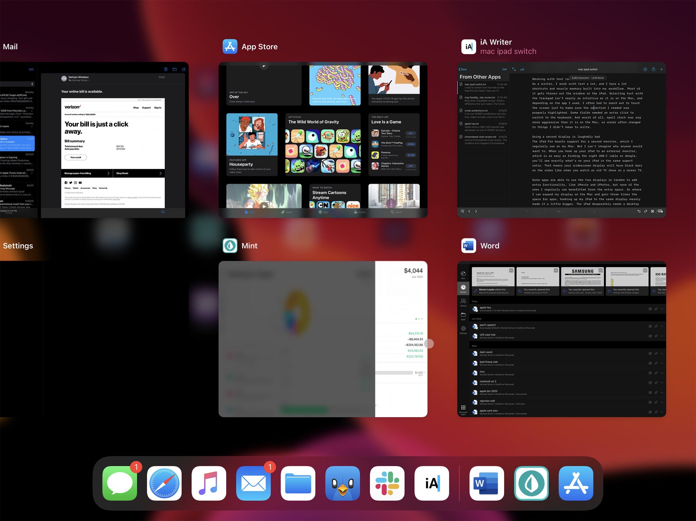
One of the main reasons why Apple split iPadOS from iOS is its multitasking advantages. But while multitasking with my Mac is effortless and seamless, on the iPad’s is kind of a confusing mess, especially when using the trackpad. Split View apps need to be opened from the Dock, a Slide Over window is impossible to close without touching the screen, and resizing is basically a guessing game.
I understand that the iPad is different than the Mac so floating windows don’t make sense, but iPad multitasking still feels Apple would address these confusions in iPadOS 14, but that doesn’t seem to be that case.
Working with text isn’t fun
 IDG
IDGWhether using touch or trackpad, text on the iPad Pro is frustrating to work with.
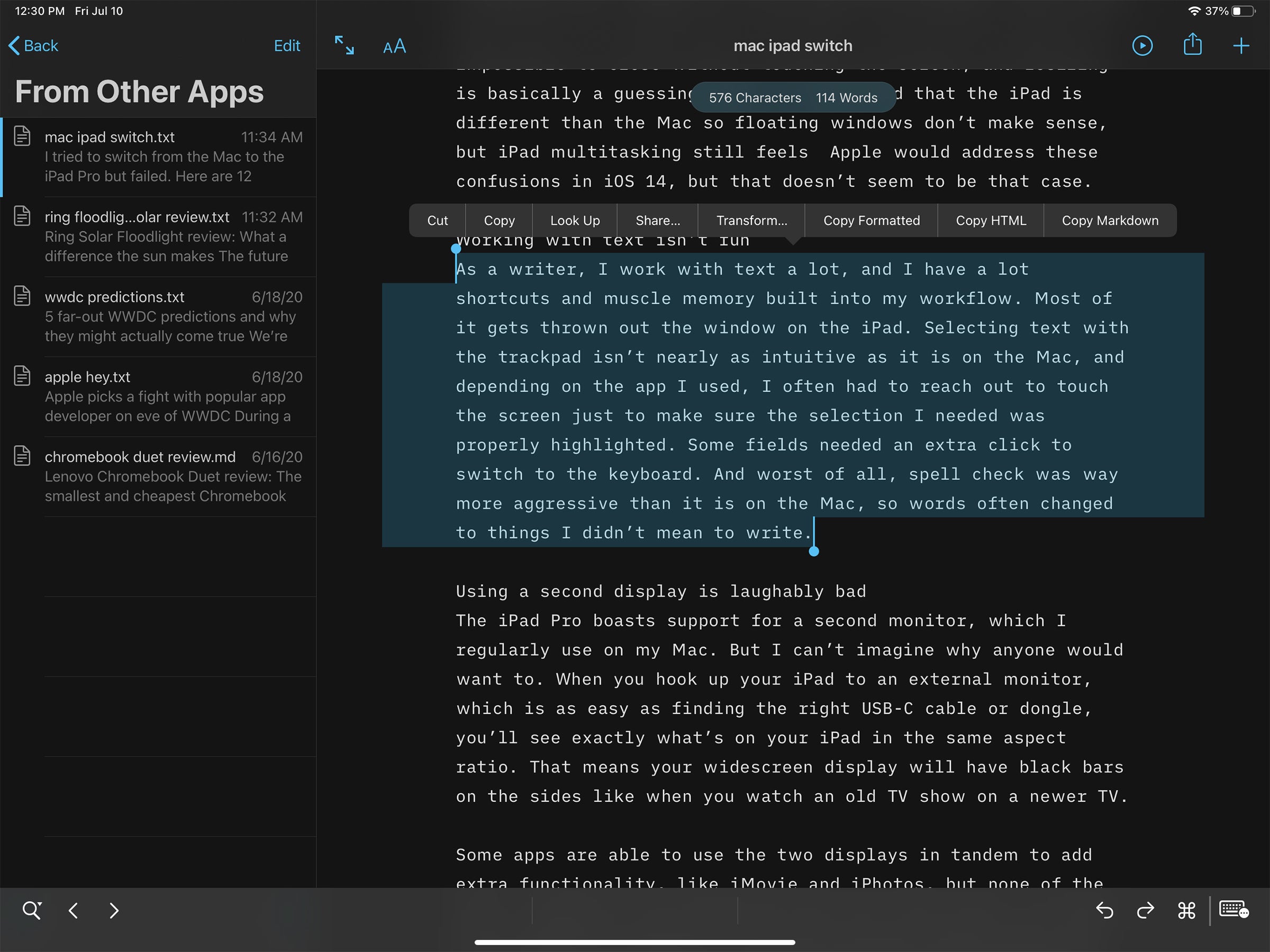
As a writer, I work with text a lot, and I have a lot of shortcuts and muscle memory built into my workflow. Most of it gets thrown out the window on the iPad. Selecting text with the trackpad isn’t nearly as intuitive as it is on the Mac, and depending on the app I used, I often had to reach out to touch the screen just to make sure the selection I needed was properly highlighted. Some fields needed an extra click to switch to the keyboard. And worst of all, spell check was way more aggressive than it is on the Mac, so words often changed to things I didn’t mean to write.
Using a second display is laughably bad
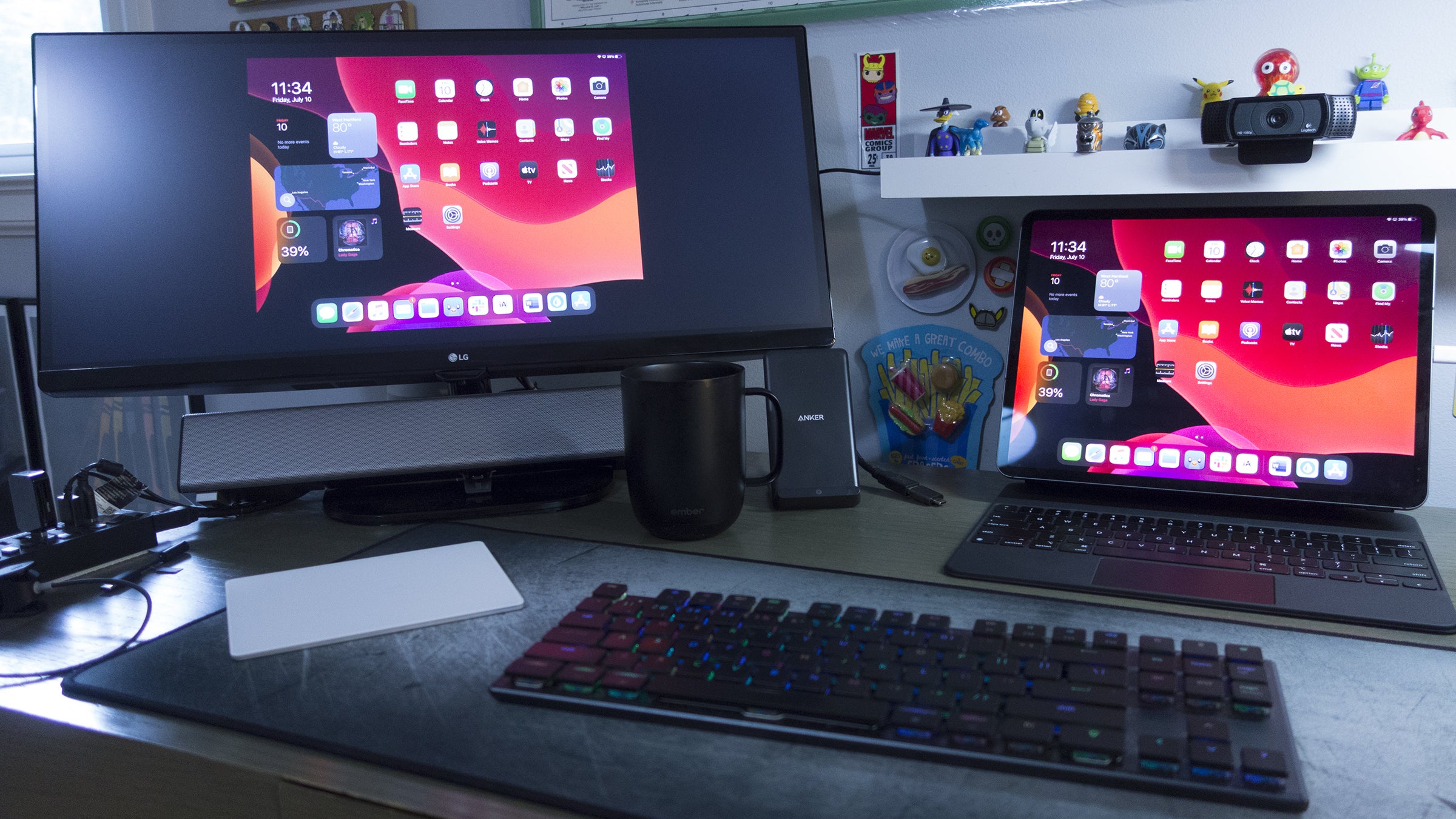
The iPad Pro boasts support for a second monitor, which I regularly use on my Mac. But I can’t imagine why anyone would want to. When you hook up your iPad to an external monitor, which is as easy as finding the right USB-C cable or dongle, you’ll see exactly what’s on your iPad in the same aspect ratio. That means your widescreen display will have black bars on the sides like when you watch an old TV show on a newer TV.
 IDG
IDGThis isn’t gonna cut it, Apple.
Some apps are able to use the two displays in tandem to add extra functionality, like iMovie and iPhotos, but none of the ones I regularly use benefitted from the extra space. So where I can expand my display on the Mac and gain three times the space for apps, hooking up my iPad to the same display merely made it a little bigger.
The iPad desperately needs a desktop mode, but unless Apple has a surprise up its sleeve, it looks like we’ll be waiting until at least iPadOS 15.
The Magic Keyboard isn’t so magical
As soon as I put my fingers on the Magic Keyboard’s keys, I was in love. Typing is aa million times better than both my butterfly MacBook Pro and the Smart Keyboard, and I really hated to give it up. I like it so much, in fact, I just bought a Bluetooth Magic Keyboard to go with my MacBook.
 Michael Simon/IDG
With the Magic Keyboard attached, the iPad Pro is about the same size as the 13-inch MacBook Pro—but it’s way heavier.
But the magic ends there. It’s too heavy, too rigid, and too hard to open. The iPad doesn’t easily come off like it does in Apple’s marketing shots. The trackpad is too small compared to my Mac, and it’s missing a function row. And the Apple logo is still sideways when you restart.
I do like that I’m able to use it on my lap thanks to its excellent weight distribution, but the iPad Magic keyboard is still a few generations away from being perfect.
Working with photos is a struggle
The iPad has come a long way as a productivity tool, and there’s a lot I can do now that I couldn’t before. My VPN and CMS worked very well, my external hard drive was instantly recognized, and working with Word was a breeze. In fact, I only had to open my Mac twice. To print (see below) and to properly crop a photo I took.
On my Mac, working with photos is easy. Just pop in the card, transfer the pictures to my desktop, open them in Photoshop, and make the necessary edits. On the iPad, it’s not so simple. While my camera’s card was recognized, it wasn’t so easy to edit my photo—and all I needed to do was crop it to a specific size. Photoshop doesn’t recognize RAW, Lightroom wouldn’t let me easily customize a crop, and Photos balked at properly importing the images so other apps couldn’t access them. I couldn’t even find a way to rename a photo in Photos to upload it to my CMS. Thankfully my Mac came to the rescue when I got desperate, but the iPad still has a long way to go when it comes to photo editing.
There aren’t enough USB-C ports
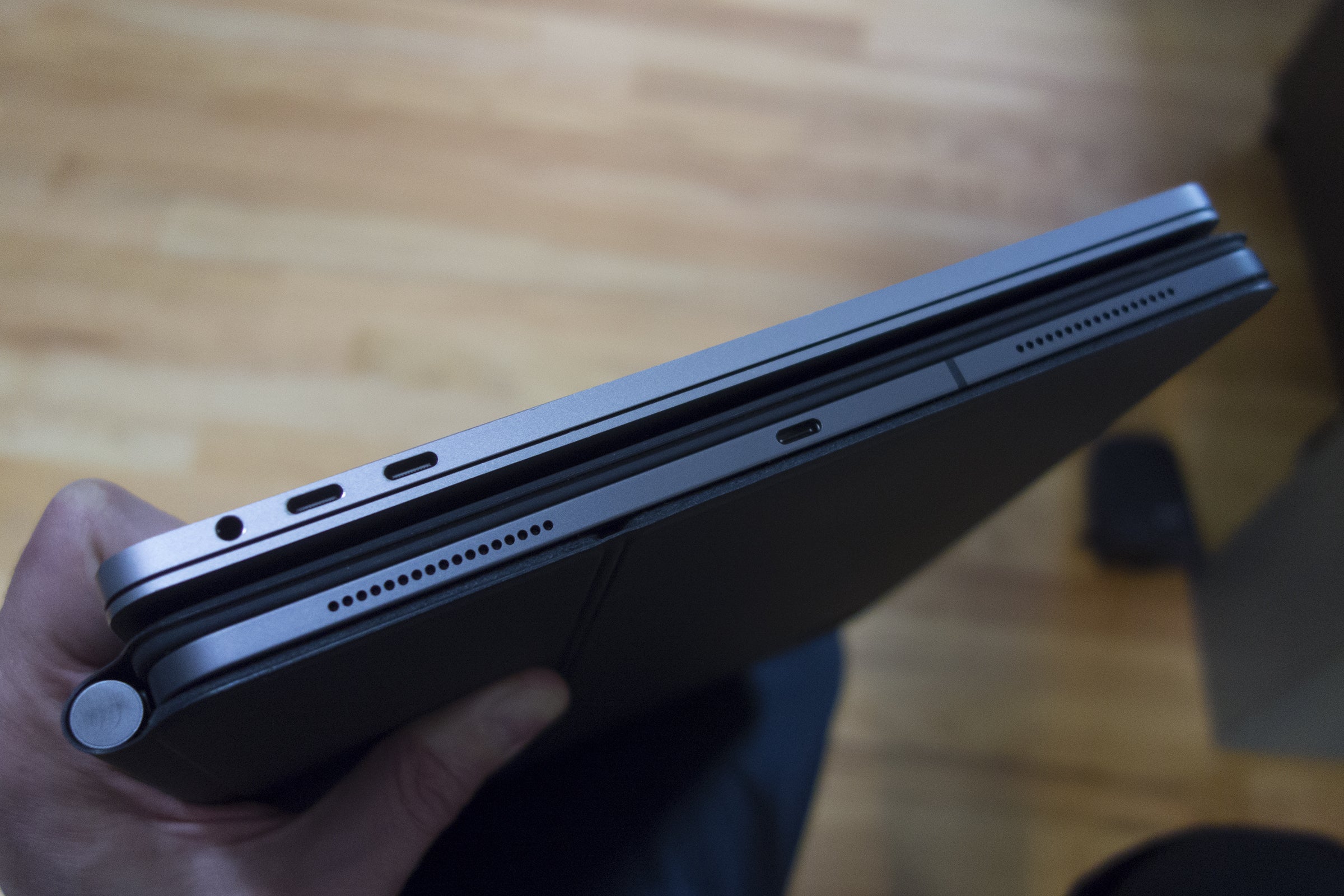 Michael Simon/IDG
The single USB-C port on the iPad Pro isn’t good enough.
Even if you spring for the Magic Keyboard, you still only get two USB ports on the iPad Pro—and only one of them can handle peripheral devices. If you want to plug in a monitor and a hard drive, you’re out of luck with buying a hub.
And while I’m wishing, it’s in the wrong spot. It should be near the bottom edge so you don’t need to see a cable dangling every time you need to plug something in.
Face ID is great with one annoying limitation
 IDG
IDGFace ID would be a welcome improvement over Touch ID on the MacBook.
When it works, Face ID is nothing less than a revelation. Pop open your iPad, look at the screen, and viola, it’s unlocked. The same goes for logins and authentication. It’s far superior to Touch ID and needs to make its way to the MacBook.
But that magical experience stops at the App Store. Face ID is supported for buying apps, of course, but the system isn’t nearly as seamless as it is with unlocking password managers and other apps. Just like your iPhone, you need to double click the power button to confirm your purchase, which isn’t the easiest thing to do when docked. It might seem like a small thing, but when you’re buying a few things each day, it takes you out of your element.
Printing is annoying
I have a relatively old Brother printer that works perfectly well with my Mac, Chromebook, and PC. But when I plugged it into my iPad to print something I needed for work, nothing happened. That’s because, despite its USB-C port, the iPad only works with AirPrint-enabled printers. Apple lists a lot of them on its support site, but I don’t see any reason why the iPad can’t just work with any USB printer.
A stock calculator really is important
It’s easy to point to one of the numerous calculators in the App Store or buy into the ridiculous excuse that Apple won’t ship one until “we can do it really, really well,” but the fact of the matter remains: a stock calculator app is sorely missing. It’s not the kind of thing you think of until you need it, and on more than one occasion I had to reach for my iPhone just to do a simple math problem. (A reader pointed out that you can do quick calculations using the search bar, but that’s a workaround not a substitute—all I want is the Mac app in a PIP window when I need to do quick calculations.
Chip speed isn’t everything
Compared to the 2017 MacBook Pro I was using, the iPad Pro is insanely fast—and that’s with an A12Z chip, not the newer A13. While apps and animations fly, the benchmarks didn’t translate into a speedier experience, at least when it comes to my workflow. Even after I was comfortable with the gestures and navigation, everything on the iPad just took longer due to its less-intuitive multitasking and menus. But Apple’s chips are ridiculously fast at the things they do, making the upcoming Mac transition extremely exciting.
I miss pinned tabs
 IDG
IDGPinned tabs on the Mac’s Safari are more useful than they look.
If this was the iPad’s only issue, I would be probably able to overlook it, but when added to the others here, it’s just another frustrating example of the iPad’s inexplicable shortcomings. On my Mac, I can keep small tabs to the left labeled with favicons so they’re easy to access without intruding on my other tabs. Even with the changes coming to iOS 14, pinned tabs remain elusive on the iPad, making Safari on the Mac superior.
And speaking of tabs, why doesn’t Ctrl-Z undo an accidentally closed tab like it does on the Mac?
Many apps have a frustrating mix of mobile and desktop controls
On the iPhone and the Mac, you know what you’re getting. Touch targets are big, navigation and menus are sensible, and the user experience is smart and adaptive. That’s not quite how it is on the iPad. With an environment that straddles the iPhone and Mac, I often felt like I was fighting the interface. No matter how fast they were, apps often felt like they were simultaneously too simple and too complicated. From Word to Tweetbot, even Photoshop, interfaces didn’t know whether they wanted to be mobile or desktop, forcing my actions to be more deliberate than with my Mac. Even after a week, I never grew as comfortable with any of the interfaces than I am with phone or PC, particularly when the keyboard was attached. Consequently, I worked slower than I did on either device.
Back to the Mac
Suffice to say, I’m writing this on a MacBook Pro. There are plenty of things to like about the iPad Pro—the design, display, Face ID, and the overall zippiness—but it’s just not ready to replace my Mac just yet. Perhaps it never will. With the upcoming transition to Apple’s own processors, the line between the Mac and the iPad Pro will blur even further, but if anything, the core differences will only get deeper.
My main issues here—multitasking, display spanning, and the cursor—might never get to the point where longtime Mac users are comfortable with them, which might be the point. My biggest problem with the iPad Pro isn’t that it’s not a Mac—it’s that Apple hasn’t clearly defined what, or why, it is.
Update 7/19: Added a section about the iPad’s processor.
[ad_2]
Source link